Skip to content

Strip Design

I have received the text from the club for the next issue of BB and although it will take me a few days to get enough time to format and publish it, I wanted to put this extract up on the board as time is of the essence.

One of the questions was related to fan input into the design of the new away strip and the club have responded as follows:

we have been very impressed with the designs put forward on the website and the idea of holding some form of competition etc is certainly on the Club radar at the moment. The majority of the designs so far submitted to the web-site would appear to be more biased towards a home kit. This season it is the intention to change our away kit and we require to submit a new proposal to Errea within the next two to three weeks.

To short circuit the system, and rather than waiting for PSD files etc can you please go on to the Errea web site and that will give you a feel for what strip designs etc are available but the information from Errea is basically (within reason) they can go with any design.

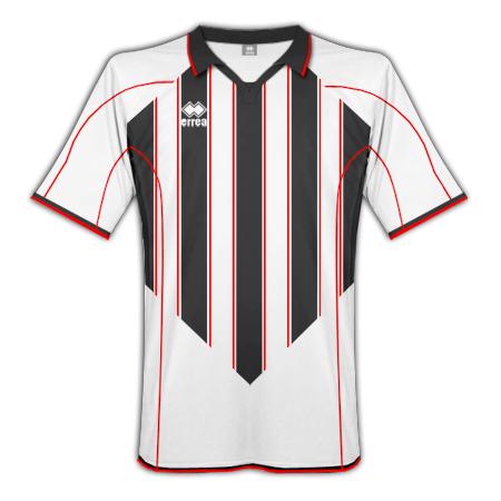
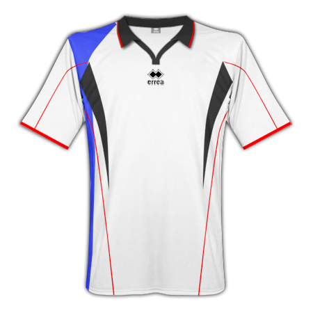
Could we point out that there is a preference from within the Club that the strip should be predominately white but can include any combinations of red/black and blue and if you upload them onto the web site we will draw them down from there.

So this is the thread for people to upload designs for AWAY KIT ONLY. Any posts showing a kit that is not predominantly white (as per the club's requirement), or that take the discussion off in other directions will be deleted.

For reference:

  • Replies 143
  • Views 18.1k
  • Created
  • Last Reply

Top Posters In This Topic

Posted Images

Featured Replies

good work, the club and yourself Scotty

as the legend that is Andy Gray would say... "take a boo"

Well done to all involved indeed :rotflmao:

May I be the first to offer the first drafts on this topic, and add a wee comment...

Designing a mostly white kit has proved rather hard so far, as whatever I come up with tends to looks rather 'rangers'-esque, and I've deleted a few designs already.

anyway - heres my first offering - i've not got any knowledge of the programs specified, so i've used my old templates from the 'New Kits' topic.

I like your first one Gringo....

I like the Maglia Antares design:

Top - white - red shoulder flashes - black short sleeve edge flashes - thin black collar line

Shorts - all black

Socks - all Red

Without the blue then the design does not look like anything Ibrox related and falls in line with the old caley white away top with a jags touch - a bit like one of the old ICT away tops - CD I am sure you could knock it together with your design skills.... :rotflmao:

  • Author

OK. playing around with a few tonight .... its pretty hard to make them look decent with white as a base ..... far easier with red or blue !!!!

First one is based on ERREA range from 08/09

post-2-1231810972.png

Next one is from A-Line range. Not so sure the Red -> Blue gradients work on the drawing, but perhaps better in real life.

post-2-1231810946.png

Finally, an extremely simple white shirt with red/blue elements.

post-2-1231810959.png

Most of these strips look like Gers away stuff, too much so, dont like saying it but it needs more black, or dark/grey red combo.

Are errea still the supplier?

Edited by Scotty
Answer: YES

been mucking about with the kit designer thing on the errea website, couple of ideas:

post-1223-1231847327.jpg

the club said predominantly white so this one aint bad

Is there any particular reason the strip has to be predominately white?? I would have thought the current away top would have been one of our better sellers...

White is so plain it doesn't leave much room for negitiation, think you have to go with a collar because the neck on the last 2 white strips from Errea was attrocious

another idea:

post-1223-1231853711.jpg

that is very nice mate... maybe not enough blue but a cracking design none the less

Couple of ideas based on the suggestions of using Black instead of Blue to differentiate us from Rangers.

post-3-1231853887.pngpost-3-1231854023.png

CD you are onto something with the one on the left - looks really good :rotflmao:

Needs a bit of blue as it reminds me of the buddies, but yes excellent ideas.

Here's an attempt at including blue, and keeping away from the "Rangers" look.

The blue is intended to be faded as opposed to a lighter blue.

post-3-1231856246.png

another couple of variations, included this one that is close to the current one:

post-1223-1231856538.jpg

something different:

post-1223-1231857321.jpg

I honestly think that a predominately white kit sounds awful, teams never look good in a white kit. I tried out some designs anyway though... (:

post-3012-1231859398_thumb.jpg

I like the Maglia Antares design:

Top - white - red shoulder flashes - black short sleeve edge flashes - thin black collar line

Shorts - all black

Socks - all Red

Without the blue then the design does not look like anything Ibrox related and falls in line with the old caley white away top with a jags touch - a bit like one of the old ICT away tops - CD I am sure you could knock it together with your design skills.... :rotflmao:

Is this in the ball park for what you are after?

post-3-1231859545.png

Spot on CaleyD - just the job!

It is spot on CD and the shorts could be inter-changed with the current all blue home shorts to give those who want to see a bit of blue in the strip when required :rotflmao:

Edited by CaleyD
Tidying Thread

Not sure if something like this is allowed/possible/practical/financially restrictive etc, but it kinda breaks with the norm a bit and could never be mistaken for any other team. If not as an official kit, it could perhaps be used on shirts for merchandising purposes only.

post-3-1231867230.png

I love that and would break my habit of not buying replica strips. I'd even get that for my kids.

:018: :rotflmao: :thumb04:

Don't think that's what they'll be after but if you decide to open a stall in Spain selling cheap replica ICT tops you might sell 1

Here's an attempt at including blue, and keeping away from the "Rangers" look.

The blue is intended to be faded as opposed to a lighter blue.

post-3-1231856246.png

I like

Guest
This topic is now closed to further replies.

Recently Browsing 0

  • No registered users viewing this page.

Important Information

We have placed cookies on your device to help make this website better. You can adjust your cookie settings, otherwise we'll assume you're okay to continue. : Terms of Use : Guidelines : Privacy Policy

Account

Navigation

Search

Search

Configure browser push notifications

Chrome (Android)
  1. Tap the lock icon next to the address bar.
  2. Tap Permissions → Notifications.
  3. Adjust your preference.
Chrome (Desktop)
  1. Click the padlock icon in the address bar.
  2. Select Site settings.
  3. Find Notifications and adjust your preference.