Jump to content
DONT PANIC! - Site Upgrade in progress. Apologies for any downtime, broken stuff, or weird looks !
Posted

It's getting to that time of year again when we wonder what next seasons home strip will be. Personally I would love it if we got shot of errea! The quailty of the strips are always pathetic and reminds me of the fake tops you can get abroad. Also with c*unty having nike i feel almost jealous of them. However I've lost all hope that we will ever get rid of errea because as far as I'm aware we get paid to use their shirts.

So, what (errea) design would you wish for in the 2012-14 seasons?

I like Brightons last two home shirts. I have a link below, just scroll down untill you find them. brighton also use errea, so just imagine either the 2010-11 0r 2011-12 shirt in blue and red and thats what i would like. A sort of barca esque blue and red striped shirt aswell would do nicely!

http://www.historicalkits.co.uk/Brighton_and_Hove_Albion/Brighton_and_Hove_Albion.htm

  • Replies 268
  • Views 36.8k
  • Created
  • Last Reply

Top Posters In This Topic

Most Popular Posts

  • Don't worry, that close up is of me wearing it, so it actually has incredible slimming properties.

  • PaderbornCaley
    PaderbornCaley

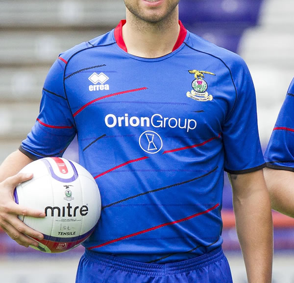
    Maybe we'll get league reconstruction in a predominately blue shirt. It's certainly different. I think I like it, but i'll need to see it up close. However, i'll be at the club shop to buy i

  • Have to laugh at all the "Hate it because it's not stripes"....sound like a bunch of spoiled kids who throw the toys out of the pram because they wanted a red ice lolly but got an orange one instead.

Posted Images

Featured Replies

If this is the best they can do, please don't sign another contract with Errea

Errea dont choose the design.

That strip is absolutely minging , far to much red and black in it .

If this is the best they can do, please don't sign another contract with Errea

Errea dont choose the design.

So maybe you can tell us who does? This is a standard Errea design with a change in colour option. If you are as informed as you think you are, you will know that Errea have a big input into the selection decision.

Nope, not for me. I like the Barca stripes.

ffs the close up is worse, terrible strip in my opinion

It's fecking HORRIBLE! 0/10

I quite like it, but then again I don't get hung up by the whole "not enough this that or the next colour" or "where's the stripes, starts, polka dots" carry on and just take the design for what it is in it's own right.

The fact so many are "hating" it is also reassuring, as I'm pretty sure the last strip to get that reaction ended up being one of our best sellers!!!

If this is the best they can do, please don't sign another contract with Errea

Errea have plenty of decent designs which have been shown on this thread. And yet someone chose this thing. :slapme:

I know, but who's the plonker that's been leading us away from the decent ones the fans want?

Why don't you ask your puppet master, they seem to know everything else!!!

2012_strip_04_300.jpg

KC: What the feck is that?

GB: I thought you said you wanted us to look like Rangers next season

KC: Nah ya numpty I said I wanted us to play like Rangers next season

Edited by Tichy_Blacks_Back

Hey its fine, and - no confusion as we will the ONLY team in the SPL wearing light blue!!!!!

  • Author

LOVE IT!!

It is different, never had a top like this one before, but I think its classy. As I can't buy a season ticket I'll definatly be buying this to help out.

My only complaint, the black 'stripe' should have been white!

The close up makes the player look like he has a pot belly, what will it do to those of us who actually do?! Not impressed I'm afraid.

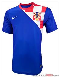
Wouldnt have minded this if our away strip was being updated:

d120_000041.jpg

Well you got the base design for the home instead, maybe they will do this for away next year

The close up makes the player look like he has a pot belly, what will it do to those of us who actually do?! Not impressed I'm afraid.

Don't worry, that close up is of me wearing it, so it actually has incredible slimming properties.

  • Author

Our most succesful seasons have come in predoninantly blue shirts. 2002-04 and 2009-10. The 02-04 actually had a torrid reception at first, everyone thought it was too much like the rangers top of 01-02 season. So maybe, just maybe......

It's a bit strange looking and is a bit too much of a mish-mash for my liking. Always preferred the stripes mind.

Ain't posted on here in yonks, even lurked but was looking for info on the top. I agree that the top is not the best but I WILL be buying one cause the club needs every penny..

Good to see the banter hasn't changed much here though..... ;)

Our most succesful seasons have come in predoninantly blue shirts. 2002-04 and 2009-10. The 02-04 actually had a torrid reception at first, everyone thought it was too much like the rangers top of 01-02 season. So maybe, just maybe......

We also got relegated in a predominately blue shirt.

I quite like it, but then i'm not too bothered about the whole Blue/white/red/black issue. This will probably be my sons first ICT top though!

Create an account or sign in to comment

Recently Browsing 0

  • No registered users viewing this page.

Important Information

We have placed cookies on your device to help make this website better. You can adjust your cookie settings, otherwise we'll assume you're okay to continue. : Terms of Use : Guidelines : Privacy Policy