KDM Evolution Trophy 2026/27
SPFL announces expanded KDM Evolution Trophy format
The SPFL has today announced the format of the KDM Evolution Trophy for season 2026/27.
Following the success of last season’s revamped competition – which included an inaugural league phase – season 2026/27 will now see more clubs compete in an expanded 40-club league phase.
The following 10 guest clubs across the Scottish Highland Football League and the Scottish Lowland Football League East and West have accepted invitations into this season’s competition:
Banks o’ Dee
Berwick Rangers
Bonnyrigg Rose
Clachnacuddin
Clydebank
Cowdenbeath
Cumbernauld Colts
Formartine United
Fraserburgh
Gala Fairydean Rovers
They will join 10 William Hill League 1, 10 William Hill League 2 and 10 William Hill Premiership B-teams in the tournament’s opening round.
Clubs participating in the league phase will be split into four pots by division, with each club playing two different opponents from each other pot, totalling six matches. William Hill Premiership B-teams will again play all league phase matches away from home.
Points gained by clubs across six matchdays will feed into one league table, with the top 22 clubs qualifying for the knock-out Round of 32.
William Hill Championship clubs will enter the competition in the Round of 32 as seeded clubs, alongside teams finishing in the top six of the league phase, with the remainder of the competition following a traditional knock-out format.
Member clubs and the Scottish FA considered the new set-up hugely beneficial for youth players in providing more opportunities in the key ‘transition phase’ of ages 16-21, as players move from the academy environment to senior football. Youth prospects aged 15 will continue to be eligible to participate in the KDM Evolution Trophy, following a successful trial. The Scottish FA Cooperation System, which was designed to strengthen youth development in Scotland, has also been extended.
Neil Doncaster, group chief executive of the SPFL, said: “We are delighted to build on the success of last season’s new-look competition by inviting 10 guest clubs to participate in next season’s tournament, which will be sure to benefit the community clubs we have invited and provide new challenges for our member clubs.
“While we will continue to minimise travel with broadly regionalised league phase matches, following discussions with our members, home clubs will now retain gate receipts in full in the league phase, to support clubs financially.”
Over £1.3 million in prize money was shared with clubs for last season’s KDM Evolution Trophy, which was an increase of more than 50% on the previous year. The SPFL is pleased to confirm that last season’s prize money has been maintained for the 2026/27 tournament, with the winners receiving £150,000, and the runners-up £100,000.
The Scottish-based, internationally operating construction firm, KDM Group, remain proud title sponsors of the competition.
Iain Jones, Chief Executive of KDM Group, said: “We are extremely excited to continue our partnership with the KDM Evolution Trophy after a highly successful first season of the new-look competition. Next season’s expanded format promises to deliver even more excitement and opportunities to clubs and players across the country, which reflects KDM Group’s support for Scottish football across all levels of the game.”
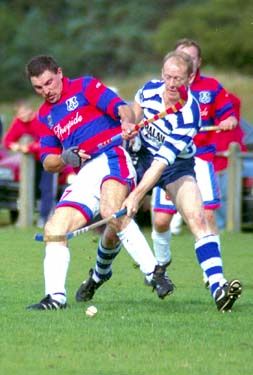
The KDM Evolution Trophy league phase will commence on the midweek of August 11/12, where participants will look to better Inverness Caledonian Thistle’s run to the final last season. Championship clubs will again enter at the Round of 32 stage on November 3/4, with the 2026/27 showpiece final taking place on either the weekend of March 27/28 or April 3/4.
The fixtures for the 2026/27 KDM Evolution Trophy league phase will be published on Thursday 16 July at 1.00pm.
The full schedule of prize money for the KDM Evolution Trophy is set out below:
Winners: £150,000
Runners-up: £100,000
Eliminated in semi-finals: £75,000
Eliminated in quarter-finals: £50,000
Eliminated in Round of 16: £40,000
Eliminated in Round of 32: £30,000
Eliminated in league phase: £15,000 - £18,500 (depending on final league position)
A summary of key competition dates is set out below:
League Phase MD1: August 11/12
League Phase MD2: August 25/26
League Phase MD3: September 8/9
League Phase MD4: September 22/23
League Phase MD5: September 26/27
League Phase MD6: October 13
Round of 32: November 3/4
Round of 16: November 24/25
Quarter-finals: January 12/13
Semi-finals: February 9/10
Final: March 27/28 or April 3/4
By
tm4tj ·


I like them .