Jump to content
DONT PANIC! - Site Upgrade in progress. Apologies for any downtime, broken stuff, or weird looks !
Posted

Now you're all probably thinking, 'why on earth are we talking about this just now?'...However next season will be our 20th year and I believe the fans should have a say in what the new strip should be like.

The current away shirt was designed after consultation with CJT and from what I've heard the final design was submitted as early as December 2012. This could mean that the club and CJT are already or are about to talk about our new home shirt for next year. So its paramount we get our views in as early as possible!

I created this topic so fans will be able to express what they would like the new shirt to be and so CJT and the club could see the fans views.

Also FC United of Manchester present their members with 4 different shirt designs every couple of seasons. The fans then get to vote for their favourite with the winning shirt being the new home/away shirt. Would the club and CJT be prepared to do this for our special 20th year?

Now, I would normally ask for simple blue and red even and vertical stripes like the 95/96 shirt. NO fancy swooshes or diagonal stripes. NO more blue than red or vice versa, 50% blue and 50% red. However with the current red and black striped away I would be open to an all blue shirt with red/black trim like our 94/95 first strip. Also I would like to see a return to white shorts like we had between 94-97.

  • Replies 618
  • Views 95.6k
  • Created
  • Last Reply

Top Posters In This Topic

Most Popular Posts

  • Went in to buy another shirt today (my wife has claimed the first one) and a guy dressed head to foot in Celtic gear came in the shop. I thought to my self " They better not be selling him tickets for

  • ICTPaisley
    ICTPaisley

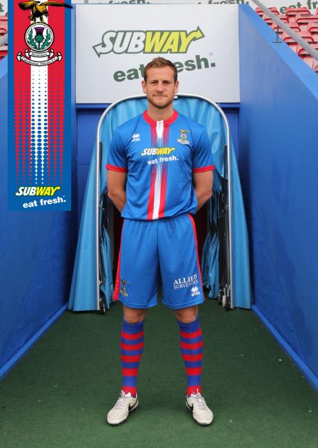
  • In light of revealing our new sponsor, a couple of kits I wouldn't mind seeing being made our own. Stupidly simple and in distant hope that Subway were to use their logo minus the slogan, I'de be more

Posted Images

Featured Replies

This was a kit that someone made in the "New Away Strip" topic (can't remember who) and I really like it as its simple and has more red in it than previous years. I think with like a crest round the badge saying "20 years" or something would be really appropriate. :ictscarf:

post-6917-0-37722100-1379709535_thumb.jp

Edited by HeScoresWhenHeWants

Whether it's the 20th anniversary or the 100th anniversary, it should always be stripes IMO.


The first kit in '94 really looking back, was a disgrace for a merged club.  It really was nothing more than Caledonian kit and while some of the more recent kits still are too blue dominated and don't have enough red (IMO), they're all still better than that first one.  I wouldn't be keen on a recreation of that first kit.

Vertical red and blue stripes all the way with blue socks and shorts.

Pity is I think we had finally got an individual identity with the blue/red vertical stripes, and it could be tweeked every 2 years. We need to be known for a certain style, and then stick to it. Keeping changing to look like The Rangers bugs the hell out of me, and its something we are better keeping away from IMO.

RED AND BLUE, OR BLUE AND RED STRIPES, ITS A MUST.

I have come up with a few reasons why fans don't get input on strips.

Novelty: Most shirts are bought soon after the release date, the impulse factor would be lost

Too many kooks: those who don't get what they want may be less likely to buy

Designers: Even with a fan design, the finished article is different, and may lead to some umbridge

Big cheeses: sponsors, investors, manufacturer, board, players, etc. may have other ideas

Designers 2: often they hold the cards, and don't like being told what to do

I suppose if we went to stripes all the time, for a bit of a change, we could change the shorts to red some seasons and have a play around with the socks as well.

As a club of many varying faces and kit designs, an Identity or more so, a brand should be imperitive I think.

So it's blue and red stripes for me, always.

I'd still go for the Basel home top design

Back to the Barca style blue and red vertical stripes. The current away strip in my opinion is awful, if it had to be black and red they should have left out the token blue on the shoulders, looks ridiculous.

  • Author

Fair point Kirishma but I just thought it would be nice to have some fan involvement for our 20th anniversary.

Personally I'm not a fan of a 94/95 replica, I just put it out there as a suggestion.....and it's pretty evident already it wouldn't go down well anyway.

A blue red vertical even striped shirt like the 95/96 would be perfect imho! However I'll still like to see a return to white shorts. A blue/red striped shirt with blue shorts and socks is all to much like Barca/Palace, even Viktoria Plzen had that combo against Citeh. I'm pretty certain we would be the only club in Europe to have blue/red stripes and white shorts, and if we are to make an assault on Europe, it would be nice to have our own identity in that sense!

@Forza: I'm actually well up for fan design but first we have to come up with some reasoned structured offer. I think people could vote for stripes, swooshes, etc. on a blind vote but as for submitting actual designs....would be a big step for fankind.

Taking this years Barcelona top as an example, I think our top next year should be like that with Red and Blue stripes and a black collar with a special crest for the 20th anniversary!

Edited by ICTRoughi

  • Author

Ahhh yes a special crest. We could go out for all gold like Swansea did last year.

@Kirishma. Its not the fans who desing the shirt. At FC United, their kit suppliers (O'niels) present 4 Different types of design to the fans whom then vote on which one they want. So in our case Errea would draw up 2/3 different Designs then we vote on what we want.

I think our board just go on the Errea website and pick a blank canvas design then have Errea do the personalisations (ie crest and sponsor).
Going back to this would be a preference

I'm a stripe fan.football_shirt_18746_1_600x560x0.jpg

As much as I like the idea of celebrating the clubs 20th, surely the club would choose to honour our 25th - quarter century - birthday. Can't see them putting in the effort for both and it would appear a little more common place..

Since it's our 20th Aniversary let's make a strip with 20 green and white hoops...

Red and blue stripes with black trim should be our identity. Currently, it is not easy to distinguish our strip at any distance from that of the team who bought over the Rangers franchise.

Edited by Kingsmills

Red and blue stripes with black trim should be our identity.

Hallelujah brother!  :notworthy:


I'd still go for the Basel home top design


Their away top is pretty cool too.


http://www.designfootball.com/design-galleries/fantasy-football-shirts/fc-basel-away-13729#joomimg


The only problem with this link is that it is an attempt at a design, not their actual away top. The real away top is white with a red/blue stripe down the middle.

Edited by Rainbow

Create an account or sign in to comment

Recently Browsing 0

  • No registered users viewing this page.
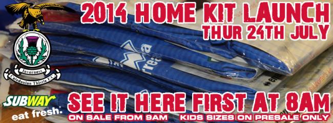
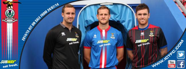
Important Information

We have placed cookies on your device to help make this website better. You can adjust your cookie settings, otherwise we'll assume you're okay to continue. : Terms of Use : Guidelines : Privacy Policy