KDM Evolution Trophy 2026/27
By
tm4tj · Wednesday at 02:15 PM 1 day


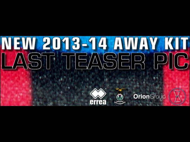
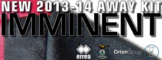
Does anyone know when the new away strip is ment to be released?