Jump to content
Posted

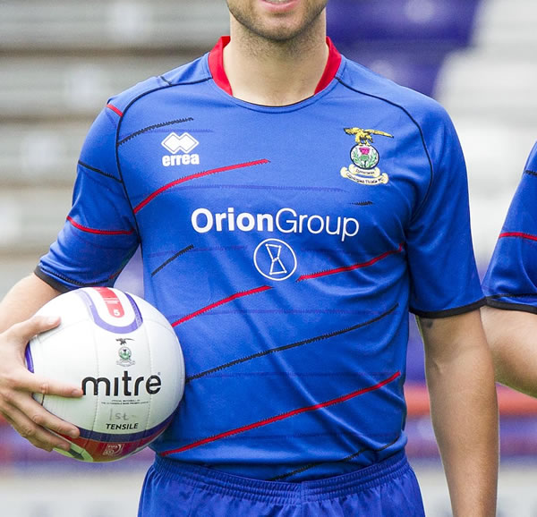
It's getting to that time of year again when we wonder what next seasons home strip will be. Personally I would love it if we got shot of errea! The quailty of the strips are always pathetic and reminds me of the fake tops you can get abroad. Also with c*unty having nike i feel almost jealous of them. However I've lost all hope that we will ever get rid of errea because as far as I'm aware we get paid to use their shirts.

So, what (errea) design would you wish for in the 2012-14 seasons?

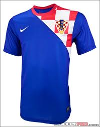
I like Brightons last two home shirts. I have a link below, just scroll down untill you find them. brighton also use errea, so just imagine either the 2010-11 0r 2011-12 shirt in blue and red and thats what i would like. A sort of barca esque blue and red striped shirt aswell would do nicely!

http://www.historicalkits.co.uk/Brighton_and_Hove_Albion/Brighton_and_Hove_Albion.htm

  • Replies 268
  • Views 36.8k
  • Created
  • Last Reply

Top Posters In This Topic

Most Popular Posts

  • Don't worry, that close up is of me wearing it, so it actually has incredible slimming properties.

  • PaderbornCaley
    PaderbornCaley

    Maybe we'll get league reconstruction in a predominately blue shirt. It's certainly different. I think I like it, but i'll need to see it up close. However, i'll be at the club shop to buy i

  • Have to laugh at all the "Hate it because it's not stripes"....sound like a bunch of spoiled kids who throw the toys out of the pram because they wanted a red ice lolly but got an orange one instead.

Posted Images

Featured Replies

Its definately a grower. When i saw it yesterday i really wasnt a fan, dont mind it today, i'm sure by the time i see the team play in it i'll like it

Just purchased mine from the club shop.

Now I see it up close, I really like it. The black and red stripes are not solid lines, they are all jaggy. From a distance it looks quite plain but up close it is really smart.

Here's a fundraising idea - lets smash our record for most tops bought in a season!

First reaction - don't like it! But it's growing on me already. The problem is that it doesn't look like a Caley Thistle home top to me, more like a 3rd strip for next season when we play in europe.

I'm all for an away top with this sort of design and really like that post with the white version but surely a home top with the vertical blue/red stripes give us identity and keep us from looking like all the other teams that play in predominantly blue.

i'll probably buy it though!

I have to say I really like this! I like stripes but it doesn't have to be every time.

Yes it does.

There are hundreds, no thousands, of teams who play in stripes of varying colours every season and their kits still vary and fans still buy them.

Our most important/visible part of our brand identity is the shirt the players and fans wear, yet we constantly mess with this (and IMO get it wrong), there are no other teams in Scotland and only 1 in the UK I believe that play in red & blue vertical stripes, it's the ideal way to make us instantly identifiable and unique but we choose to ignore it.

Try wearing a non striped ICT shirt in Glasgow and folk think you are a sevco fan: blue with red bits = sevco. And the same goes for most other parts of Scotland too, in fact Inverness is probably the only exception.

Maybe it's because I work in the design industry that I feel the whole brand identity thing matters a lot, maybe I'm just need to get out more!

Either way, I'll find a different way to put money into the club although I am sure my Dad will buy the shirt for me for my birthday (again - thanks Dad!).

And I should add my opinion has no pre-merger influence whatsoever.

We've had a lot nicer tops, it's ok though. Not usually a regular buyer of shirts whenever they come out but will definitely be getting this one at the weekend, more than ever now the club needs our full backing in terms of money and support.

Don't like it at all and won't be buying it. Why mess with the solid stripes?

I also liked the stripes and I wish they had stuck with them. It does look a bit Rangers esque. Doubt I'll get one for myself but that's more down the keech Errea quality than anything tbh (could be swayed if I like it a lot more in the flesh though). Out of curiosity does anyone know if they do baby sizes i.e. 12-18 or 18-24 month?

I have to say I really like this! I like stripes but it doesn't have to be every time.

Yes it does.

There are hundreds, no thousands, of teams who play in stripes of varying colours every season and their kits still vary and fans still buy them.

Our most important/visible part of our brand identity is the shirt the players and fans wear, yet we constantly mess with this (and IMO get it wrong), there are no other teams in Scotland and only 1 in the UK I believe that play in red & blue vertical stripes, it's the ideal way to make us instantly identifiable and unique but we choose to ignore it.

Try wearing a non striped ICT shirt in Glasgow and folk think you are a sevco fan: blue with red bits = sevco. And the same goes for most other parts of Scotland too, in fact Inverness is probably the only exception.

Maybe it's because I work in the design industry that I feel the whole brand identity thing matters a lot, maybe I'm just need to get out more!

Either way, I'll find a different way to put money into the club although I am sure my Dad will buy the shirt for me for my birthday (again - thanks Dad!).

And I should add my opinion has no pre-merger influence whatsoever.

I prefer the stripes as it is unique

now we have a home and away shirt which are both similar to a certain 3rd division team

that said my son still will want one and yes I will again have to by him an adult one as I have had to do the last 2 times as the childrens sizes are soooo small ( he is 11! and not exactly large)

Have to laugh at all the "Hate it because it's not stripes"....sound like a bunch of spoiled kids who throw the toys out of the pram because they wanted a red ice lolly but got an orange one instead. Nothing wrong with the orange one, it's just that it's not what they wanted, but suddenly it becomes disgusting and you'd think someone was trying to poison them with it.

Have to laugh at all the "Hate it because it's not stripes"....sound like a bunch of spoiled kids who throw the toys out of the pram because they wanted a red ice lolly but got an orange one instead. Nothing wrong with the orange one, it's just that it's not what they wanted, but suddenly it becomes disgusting and you'd think someone was trying to poison them with it.

CD I understand what you are saying but all this interaction previously about brand ICT and this is the result. If the club were serious about that then they would not be changing it again. Yes I like some others would prefer to see blue and red stripes as part of that identity but that does not appear to be the case. If our strip is going to be predominately blue (top, shorts, socks) going forward then fine but can the club just decide on it so that we can create a recognisable identity that is part of this so called ICT brand. I am sure St.Mirren, Kilmarnock and Celtic (Palace and Barca even) fans would have a similar response if their first team kit was changed to a similar design.

I am with KB on this and I just think it was another lost opportunity by our club. God I would love to be at just one of these boardroom meetings to see what is on the agenda and how these issues are discussed. One thing is for sure at present 'one step forward two steps back' is just about right to describe those providing direction for our club.

PS - I suppose nobody out there has access to any MoM - I need to be cheered up :wink:

Totally agree TBB. This is all part of our identity which should have a major influence on our marketing. Say no more. :unsure:

Edited by caleyboy

Have to laugh at all the "Hate it because it's not stripes"....sound like a bunch of spoiled kids who throw the toys out of the pram because they wanted a red ice lolly but got an orange one instead. Nothing wrong with the orange one, it's just that it's not what they wanted, but suddenly it becomes disgusting and you'd think someone was trying to poison them with it.

I wanted a striped shirt sure but not because "it's what I wanted" I think it's part of our teams (and fans) identity and something we should maintain and build upon. As I said I will still put money into the club but in another form, it'd be folly in the current climate to as you suggest "throw the toys out". Also I'm fairly sure my Dad will purchase one as a gift and so the club are not missing out financially. I'm surprised by your response, regardless of whatever opinion you have on the strip.

Have to laugh at all the "Hate it because it's not stripes"....sound like a bunch of spoiled kids who throw the toys out of the pram because they wanted a red ice lolly but got an orange one instead. Nothing wrong with the orange one, it's just that it's not what they wanted, but suddenly it becomes disgusting and you'd think someone was trying to poison them with it.

CD I understand what you are saying but all this interaction previously about brand ICT and this is the result. If the club were serious about that then they would not be changing it again. Yes I like some others would prefer to see blue and red stripes as part of that identity but that does not appear to be the case. If our strip is going to be predominately blue (top, shorts, socks) going forward then fine but can the club just decide on it so that we can create a recognisable identity that is part of this so called ICT brand. I am sure St.Mirren, Kilmarnock and Celtic (Palace and Barca even) fans would have a similar response if their first team kit was changed to a similar design.

I am with KB on this and I just think it was another lost opportunity by our club. God I would love to be at just one of these boardroom meetings to see what is on the agenda and how these issues are discussed. One thing is for sure at present 'one step forward two steps back' is just about right to describe those providing direction for our club.

PS - I suppose nobody out there has access to any MoM - I need to be cheered up :wink:

I get that and I don't disagree with the idea of creating an "identity" via stripes (or any other design). What I was getting at is that just because it's not striped does not automatically make it a horrible shirt....which is the stance some people seem to be taking. I'd like to see the wardrobe of these people to see if all their clothes are striped!!!

We will never have a shirt that we will all agree on or like (human nature, opinions and some folk are just never happy :slapme: ) and am certainly not blessed with any fashion sense of note as well but I feel I've made my point regarding my opinion on why I am very disappointed with the absence of our stripes.

BTW for what little it's worth (excluding the stripe factor) I think the only home shirts we have had that are worse than this are the very first ever one (and possibly the one we wore in the Feb 8th 2000 game). But this is only opinion, many will disagree and it's best to never take fashion advice from me!

If it was left to me we'd end up with Blue and Red Tie-Dye :lol:

The main thing is that sales seems to be going well...long may that continue.

Ha!

At least you'd make ones with realistic sizing! I agree the financial aspect is the most important thing at the mo.

I am just very disappointed with the choice but I've made my point, can't change things now.

You could always paint on your own red stripes.

Love the references to the barca stripes. Anyone seen their strips this year? Home one's got a single sort of sprayed on stripe down the middle and the away one is utterly horrific. They are nike though so they have that lovely swooshy thing going on, so just thank goodness we haven't followed that road. On the quality of errea, this seasons look no bad and the fact that the sponsor logos are dye sublimated should stop them falling off. I originally thought it looked like a beach towel but now I'll probably get one on saturday. You really have to see that barca away strip though......

Got mine today...Get one if you can and support you club!!

I like that template when I stumbled across it on the errea site and was one of few folk who said it's be good for an away top, never expected it to be the home top.

Whilst I'm a rather big fan of the stripes and would rather keep them for the whole 'branding' effect, I still quite like this. It's far from "horrible" purely because it has no stripes, it does suffer though with the lines constantly having to break to make way for the sponsor and badge. Would have rathered it ran through the sponsor atleast, take the black line between sponsor and badge for example, it just looks utterly stupid.

Offt and as for Barca'.. it's not like they need to reassure themselves for anything, they're not risking losing out on any fanbase, money or support. It's also not their worst away top.

Maybe the board's thinking was, bring out a different design and everyone will buy it because it's not just another one with stripes. It should be a 3rd strip/ training top.

We're still a young team that needs identity. As dodgy as it is, at least Barca have stuck to the vertical design, 2/3 blue 1/3 red and it's still instantly recognizable as a Barca top.

I think most would agree that we'd rather be the Barcelona of the north than the huns of the north. Even the Crystal Palace of the north!

As long as there's a weed in the clubs badge it doesn't matter one hoot to me whether the strip is striped,hooped or predominantly one colour whether that be blue,red,black or pink

Having said that it's good to see younger fans in the city cladded in their locals team strip rather than teams from Glasgow or Aberdeen

I appreciate that it's big business and a money spinner for clubs to sell replica tops but I feel that it should really be aimed for younger fans and rightly so, anyone over the age of 35 in a footie top looks like a roaster in my opinion

It's that long ago I can't remember the last replica top I bought, these days I prefer to dress smart at the footie but in comfort I.e adidas, sergio tacchini or stone island

Dougal

Create an account or sign in to comment

Recently Browsing 0

  • No registered users viewing this page.

Important Information

We have placed cookies on your device to help make this website better. You can adjust your cookie settings, otherwise we'll assume you're okay to continue. : Terms of Use : Guidelines : Privacy Policy